Operational Overview
Ingredients, Menu & Service Model
Ingredients, Menu & Service Model
Ingredients, Menu & Service Model
Operational Overview
FAMILIAR ATMOSPHERE, VIBRANT, AUTHENTIC & MODERN
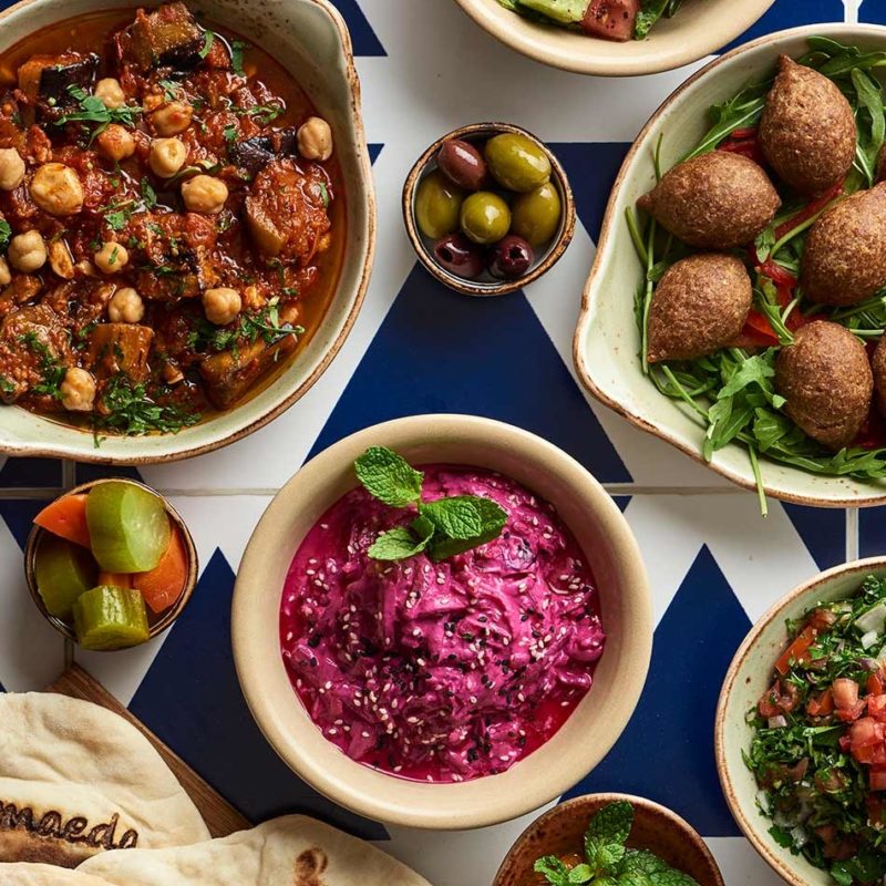
Everywhere you look: Fresh ingredients, menu and service model, lively, open environment and friendly staff. An all-day dining concept that reflects current trends and tastes and puts guests in charge of what, when and where they eat. Guests feel comfortable with menu choices and options, the open and inviting space, and the staff's welcoming service style.
Recipe Cards
Operations
Operations
Recipe Cards
-

Soups & Mezza
Soups & Mezza
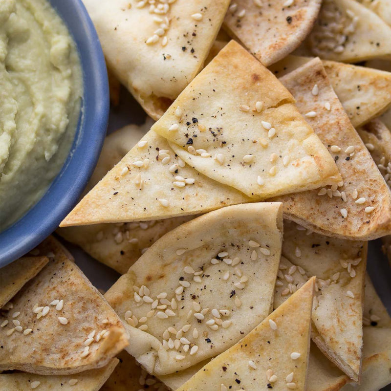

Bread & Falafel
Bread & Falafel
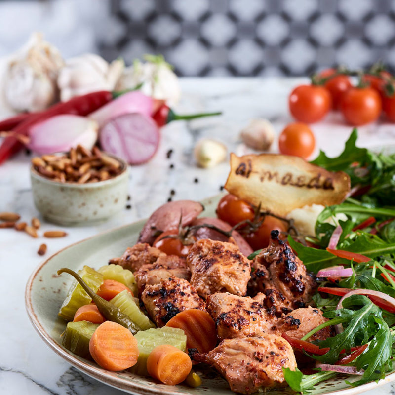

Meat & Seafood
Graphic Identity
Operations
Operations
Logos & Patterns
Logos & Patterns
Logos & Patterns
-
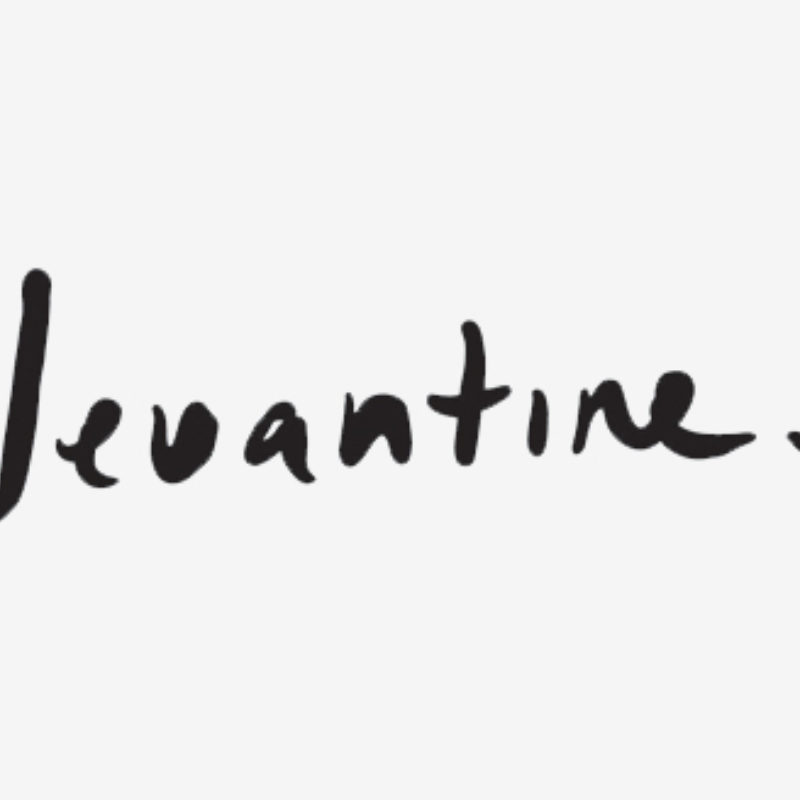

Levantine Logo
Levantine Logo
The Levantine wordmark is created with a set of unique hand rendered letterforms. This bespoke collection of letters make up the wordmark. The visual strength of the wordmark allows for its application across a vast range of platforms and deliverables, however in order to guarantee its universal quality it is vital that its application is always consistent and considered—creating unity across the entire brand.
Due to its highly distinctive nature, it is vital to protect the integrity and recognition of the wordmark. In order to do this it must appear at the same primary size (77mm) across all printed collateral and menus. It can be scaled up or down depending on its application, but must never be used smaller than 35mm, to ensure its legibility across all applications. It must always be surrounded by a safety area or exclusion zone, which is measured from the height of the letterform ‘e’, which also can be used as a solid filled brand device. The wordmark must only ever appear in the two brand colours or white.
Download
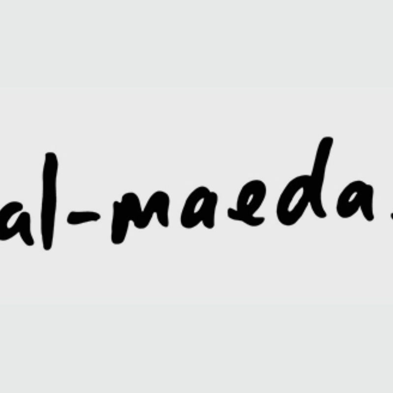

Al-Meida Logo
Al-Meida Logo
When Al-Maeda is in use, the alternative strapline, ‘Spirit of Levant’ must always be used. This strapline is added to the wordmark, creating a fixed relationship between the two. This is referred to as the brand lockup. This arrangement must be used where possible and never modified or recreated. The lockup must be used whenever possible, across all implementations of the brand. The only exceptions are on the external signage or when the wordmark is applied to a highly detailed photographic background or when the wordmark’s width is below the primary usage dimensions. The distance between the wordmark and the strapline is the height of the letter ‘i’ and measured from the second lowest letter of the wordmark, the ‘e’.
Download
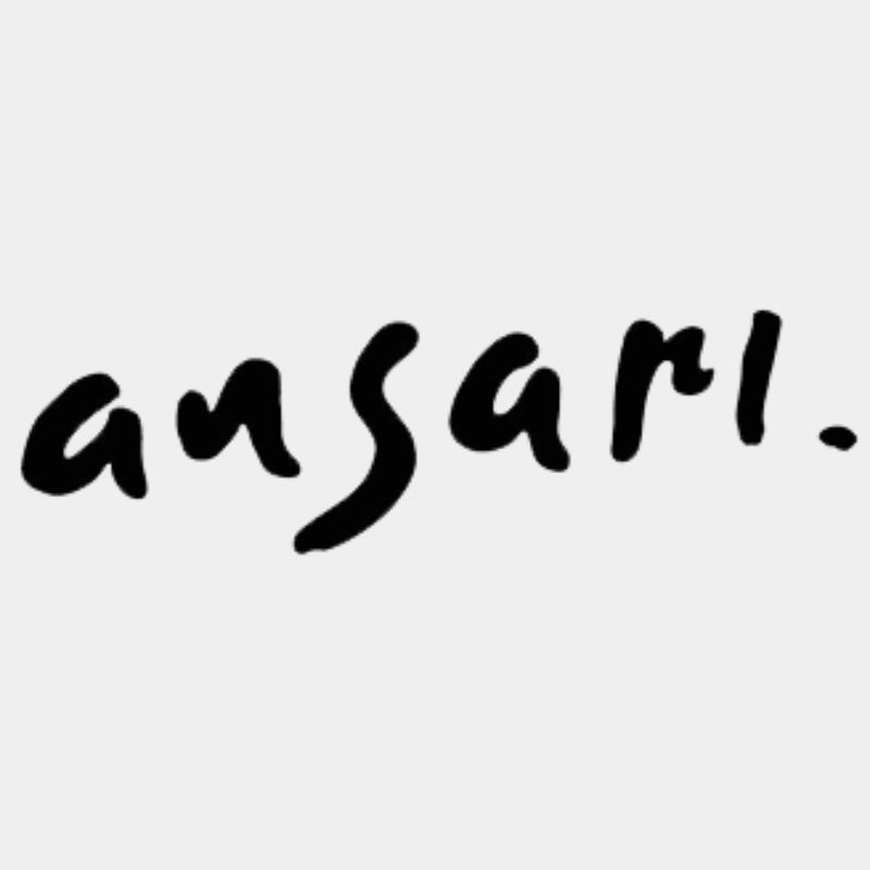

Ansari Logo
Ansari Logo
When Ansari is in use the alternative strapline, ‘Spirit of Levant’ must always be used.
This strapline is added to the wordmark, creating a fixed relationship between the two. This is referred to as the brand lockup. This arrangement must be used where possible and never modified or recreated.
The lockup must be used whenever possible, across all implementations of the brand. The only exceptions are on the external signage or when the wordmark is applied to a highly detailed photographic background or when the wordmark’s width is below the primary usage dimensions.
The distance between the wordmark and the strapline is the height of the letterform ‘i’ and measured from the second lowest letter of the wordmark; the ‘e’ character.
Download


Color Palette
Color Palette
The Levantine wordmark must always appear in the brand berry colour. In scenarios where this is not possible, often when being applied to photographic or busy backgrounds, the wordmark may appear in Levantine Charcoal or pure white. This will depend on the main colours of the background of which the wordmark is being applied to. The Levantine Charcoal must also always be used for any body copy text, including menus, stationery and online communications. There are also four other supporting brand colours which are to be used as part of the bespoke Levantine pattern work, and as highlight colours where necessary.
Download PDF

Artwork
Artwork
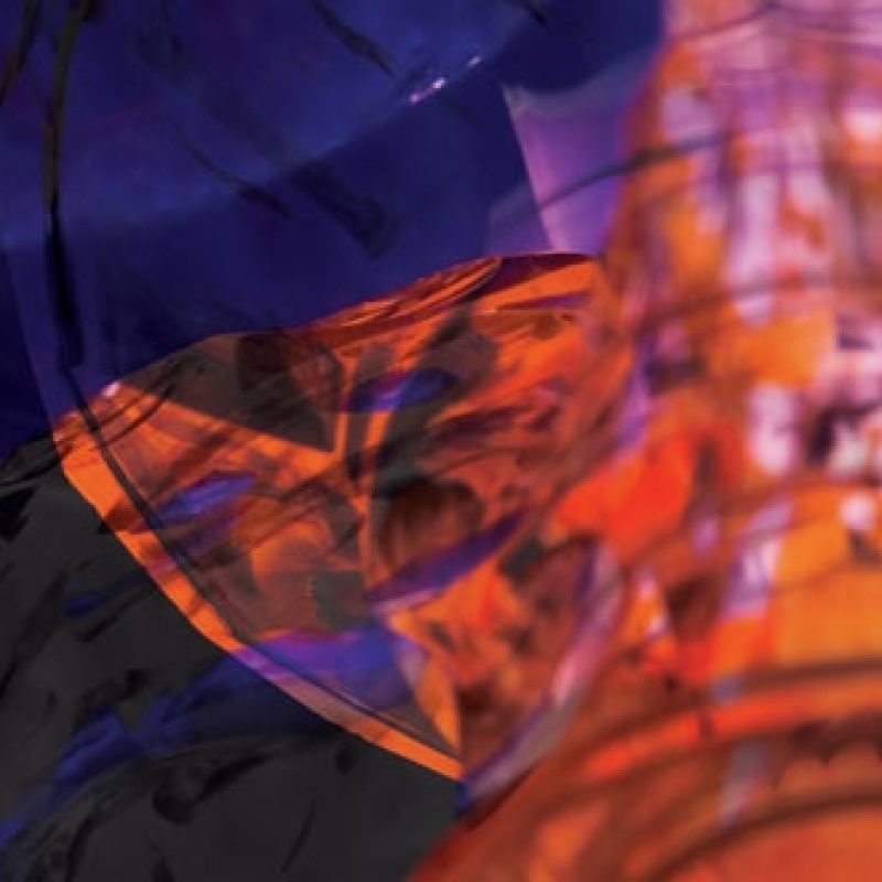
PHOTOGRAPHY DIRECTION
Any images used in conjunction with the brand, must be inherent of the concept. The colours and content must always be similar to the examples shown, continuing the level of quality and aspiration which the brand offers. The example images shown are for inspirational purposes only and must not be used due to copyright.
Download PDF

Fonts
Fonts
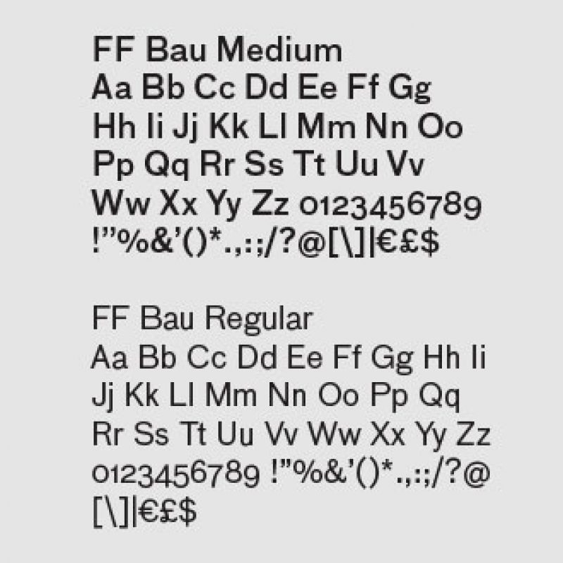
FF BAU
FF Bau is the primary typeface of the brand and must always be the first choice for text usage.
A clean and contemporary typeface, which has been strongly inspired by pioneering type casts from a century ago. This contemporary progression is rationalised perfectly alongside the spirit and warmth of its inspiration.
The font files are not supplied, but in order to use them as directed, licenses are required and can be purchased from FontFont. (www.fontfont.com)
AKURAT MONO
Akkurat Mono is the secondary typeface and must be used in support of FF Bau on all customer materials.
A solid and reliable typeface with remarkable legibility. Its contemporary freshness, is balanced alongside its traditional pragmatic roots, a combination which ensures optimal readability across print and digital platforms.
The font files are not supplied,but in order to use them as directed, licenses are requiredand can be purchased from Lineto. (www.lineto.com)
SABON LT STD
Sabon is the tertiary typeface and must always be used for large amounts of text in all corporate products of the brand.
A traditional and refined serif typeface, perfect for large amounts of body copy. Famous for its usage in book typography, business documents and corporate design.
The font files are not supplied, but in order to use them as directed, licenses are required and can be purchased from Linotype. (www.linotype.com)
USAGE & DETAILING
The aforementioned typefaces must be the only typefaces used within all brand materials. To elevate the brand typography a selection of detailed typographic considerations must be adhered to, in order to effectively contribute to the distinctive typographic direction of the brand.
The size of type is referred to as the point size, which can be chosen and considered depending on its usage, but must never change on the stationery and menus.
The vertical spacing between each line of body copy is referred to as the leading, this can be adjusted depending on its application, but must never be tighter than 120% of the point size. This will maintain clarity and readability.
Usage & Detailing
The horizontal spacing within letters is referred to as tracking or kerning, this can be adjusted where necessary, but must never become a negative value. Tracking is the spacing of an entire block of text, which will determine the amount of characters per line and generally effect the amount of white space amongst the text. Kerning is the space solely between two individual characters, this is often only necessary to amend or adjust headings and larger usages of text where the visual quality and refinement of these details are more apparent.
All of the above are vital in order to effectively maintain the clean and distinctive typographic stylings of which this manual explains and exemplifies.
Download PDF

Hierarchy & Arrangement
Hierarchy & Arrangement
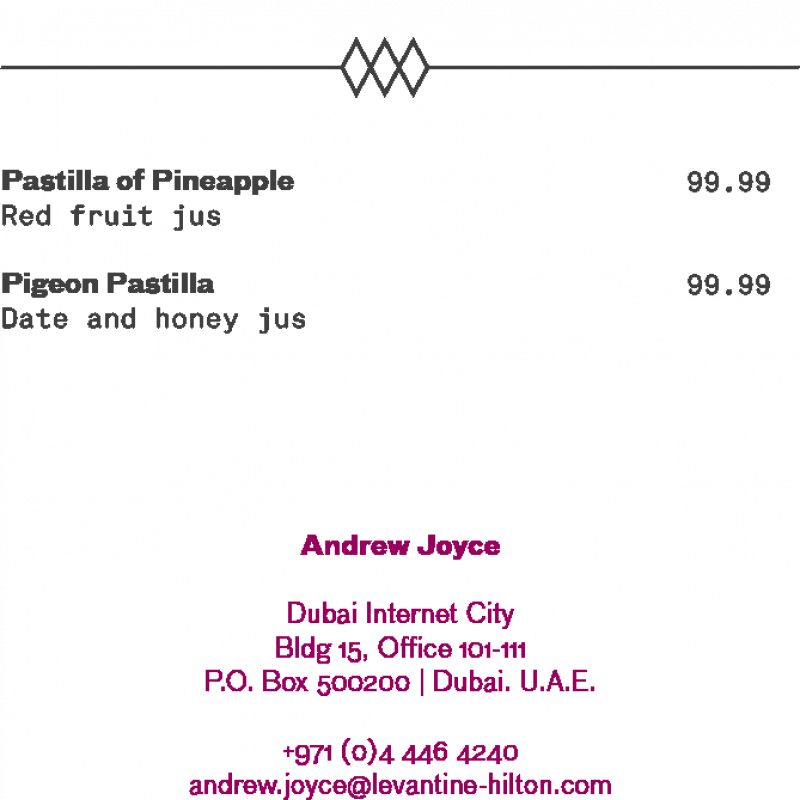
Once all of the sizing and spacing has been distinguished, further considerations into emphasis and hierarchy must be carried out.
When more than one point size or weight is required, the difference between the selections must be clearly distinguishable. This contrast will create an effective hierarchy and offer a natural journey throughout a design.
The typography within the brand has an option of alignments, but these must always be consistent throughout. Main body copy must always be ranged left. Headings should be centred and occasionally left aligned if necessary. All contact details upon corporate stationery is centrally aligned. With ranged left type, it is important to balance the ragged right edge, and with centre aligned type it is important to equally balance line length, when there is more than a single line of text.
All artwork files supplied must not have their alignments changed and any modifications or further additions must comply to the current design files.
Download PDF
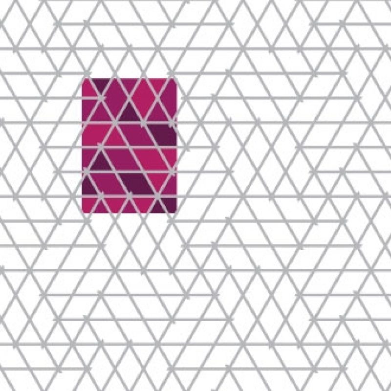

2-D Pattern Design
2-D Pattern Design
The Levantine brand pattern is a bespoke and uniquely created brand application, which is to be used to full effect across both two and three dimensional deliverables.
The pattern itself is modest and contemporary, whilst offering nods to existing traditional and geometric Arabic patterns.
The pattern offers various amounts of applications, but must only ever be used in the six scale variations across its three dimensional implementation. These are shown on the successive pages.
The two dimensional application of the brand for the corporate stationery will be supplied as complete artwork files and must never modified.
PATTERN IMPLEMENTATION ON (2D)
The two pattern variations which are used for the two dimensional side of the brand, create the artwork for the reverse of the stationery items. Only the supplied files may be used and never modified or recreated. See PDF for further directional usage and print specifications.
Download PDF
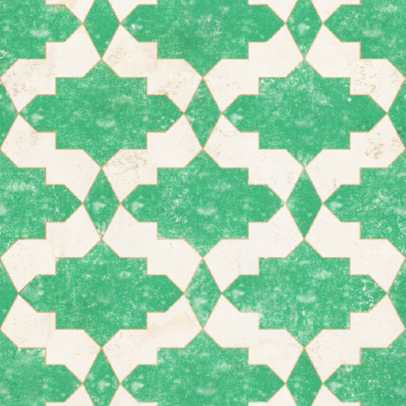

3-D Pattern Design
3-D Pattern Design
The Levantine brand pattern is a bespoke and uniquely created brand application, which is to be used to full effect across both two and three dimensional deliverables.
The pattern itself is modest and contemporary, whilst offering nods to existing traditional and geometric Arabic patterns.
The pattern offers various amounts of applications, but must only ever be used in the six scale variations across its three dimensional implementation. These are shown on the successive pages.
The three dimensional application is shown on the individual detail drawings. The pattern artworks will be supplied as individual files for each separate application, which are already cropped to the required heights. The widths will then be provided to allow for the maximum scenarios and the required site specific crop can then be taken.
PATTERN IMPLEMENTATION ON (3D)
The height from which each application is taken is always constant within the interior design scheme, but the width is variable.
The files will be supplied with the maximum widths required to suit the site specifics—although preferred widths are given on the following pages.
The height of the patterns, must always be as indicated, and must always use the supplied artwork. If however a on the occasion of this being impossible, please refer back to the master pattern file to take a suitable area of the artwork.
WALL PAPER PATTERN
A bespoke wallpaper pattern has been designed for the Bar and Semi-Private Dining Rooms. This must always be printed to scale, and never modified or recreated.
The pattern is designed, so that its vertical repetition is flawless. It is paramount that it is always hung to ensure a perfect repetition match along the cut edge.
See WP01 for full specification and suppliers details. Manufacturing artwork is produced under control sample ref. no. CP01870
Download PDF
Menus
Menus
Menus
-
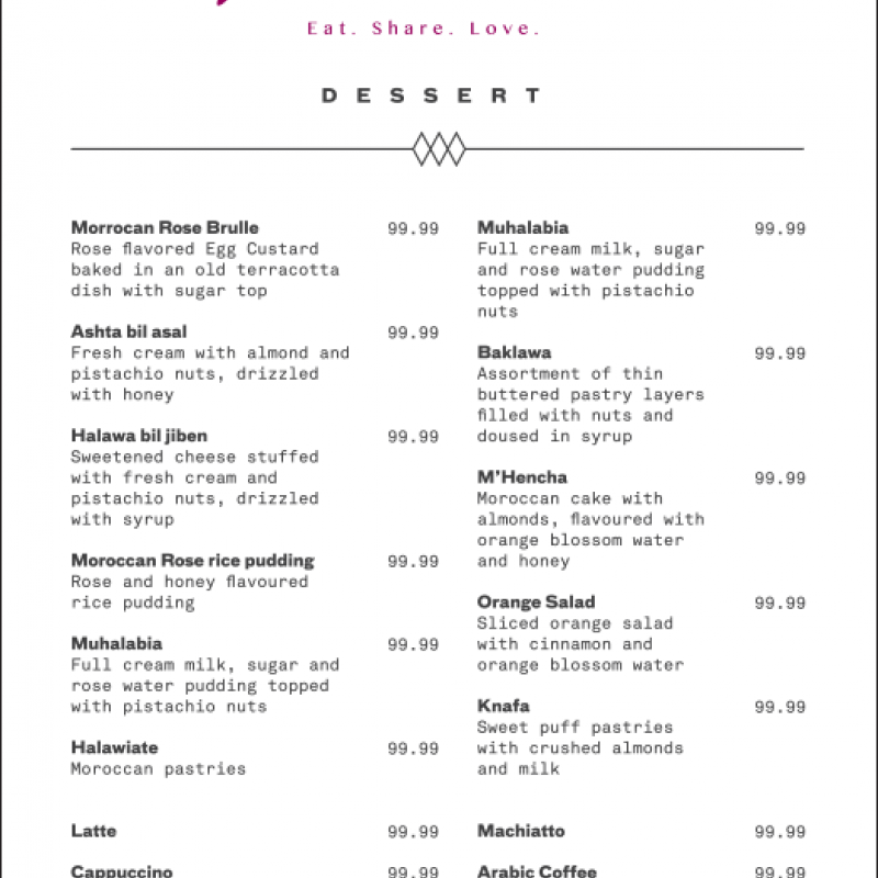

Dessert Menu
Dessert Menu
There are three menus, which will be printed as part of the Levantine brand. These are the main dining, beverage and desserts.
Example files will be provided as a guide to work toward and the successive pages explain the construction and typographic detailing.
When these files are to be printed the following print specification must be sent to the printer along with the supplied artwork. Neither the artwork nor the print specifications may be modified.
Download PDF
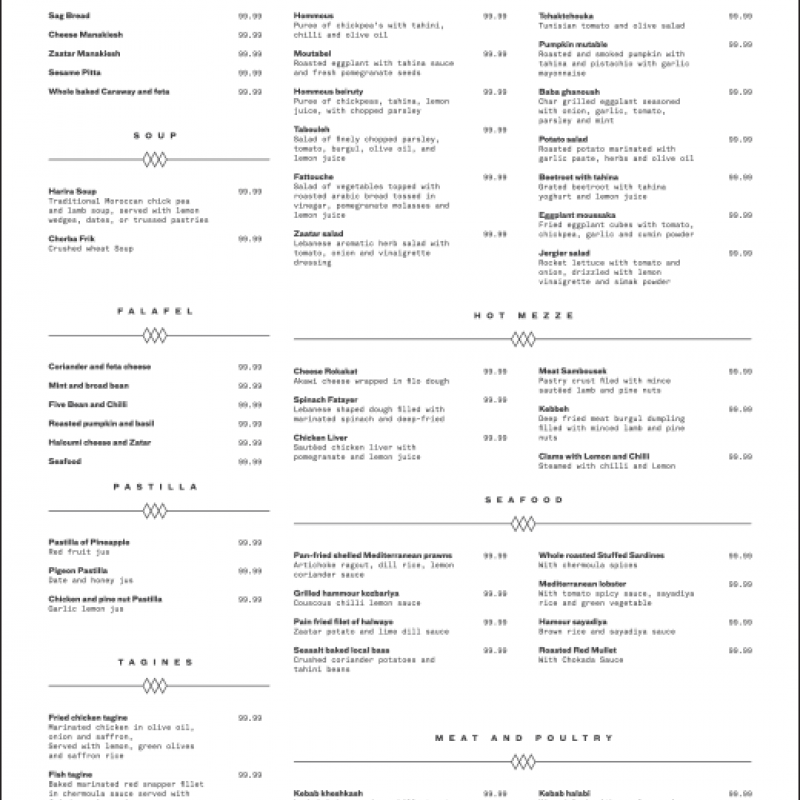

Dining Menu
Dining Menu
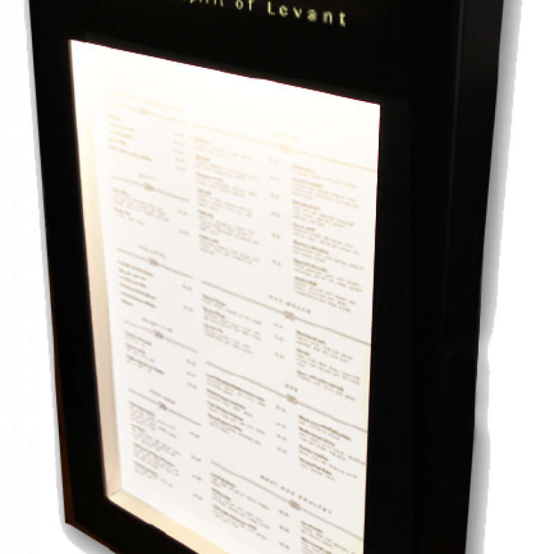
The A3 main dining menu will be displayed in an internally illuminated, black powder coated metal menu case. These will be mounted beside the internal restaurant entrance doors.
Download PDF
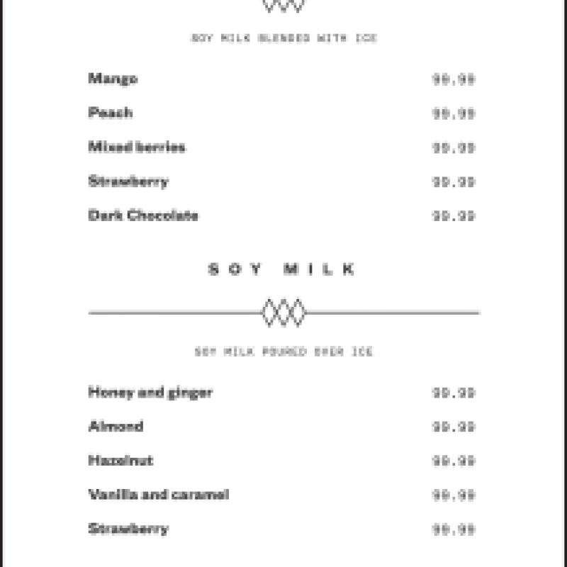

Drinks Menu
Drinks Menu
There are three menus, which will be printed as part of the Levantine brand. These are the main dining, beverage and desserts.
Example files will be provided as a guide to work toward and the successive pages explain the construction and typographic detailing.
When these files are to be printed the following print specification must be sent to the printer along with the supplied artwork. Neither the artwork nor the print specifications may be modified.
Download PDF

Typography Menu
Typography Menu
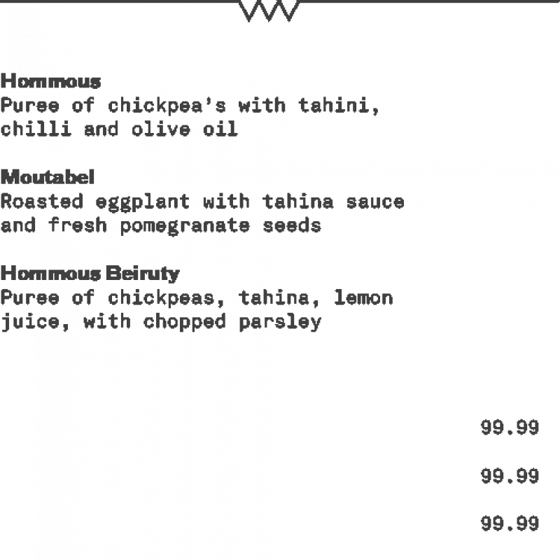
In order to maintain successful communication and brand integrity it is important to create the menus using the correct typographic detailing.
All headings are set in FF Bau 8/10pt upper case, centrally aligned, with 750 tracking.
All dish titles are set in FF Bau 8/10pt title case and left aligned. All dish descriptions are set in Akkurat Mono 8/10pt sentence case and left aligned.
All prices are set in Akkurat Mono 8/10pt sentence case and left aligned.
Download PDF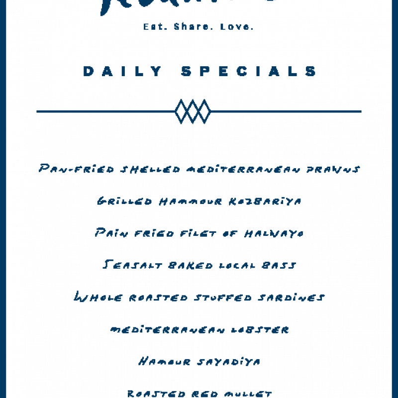

Specials Menu
Specials Menu
The Daily Specials menu will be displayed on the first glass panel, which gives a view into the display kitchen. This will be seen upon arrival into the restaurant.
The artwork will be applied with vinyl in Pantone 2965U, with space for the dish titles to be added by hand, in the space given. The dish titles must be written using a non-permanent navy blue pen, which can write on glass.
The vinyl must be centred both horizontally and vertically on the glass panel.
Download PDF

Externals Menu
Externals Menu
The A3 main dining menu will be displayed in an internally illuminated, black powder coated metal menu case. These will be mounted beside the internal restaurant entrance doors.
Download PDF
Stationary
Stationary
Stationary
-
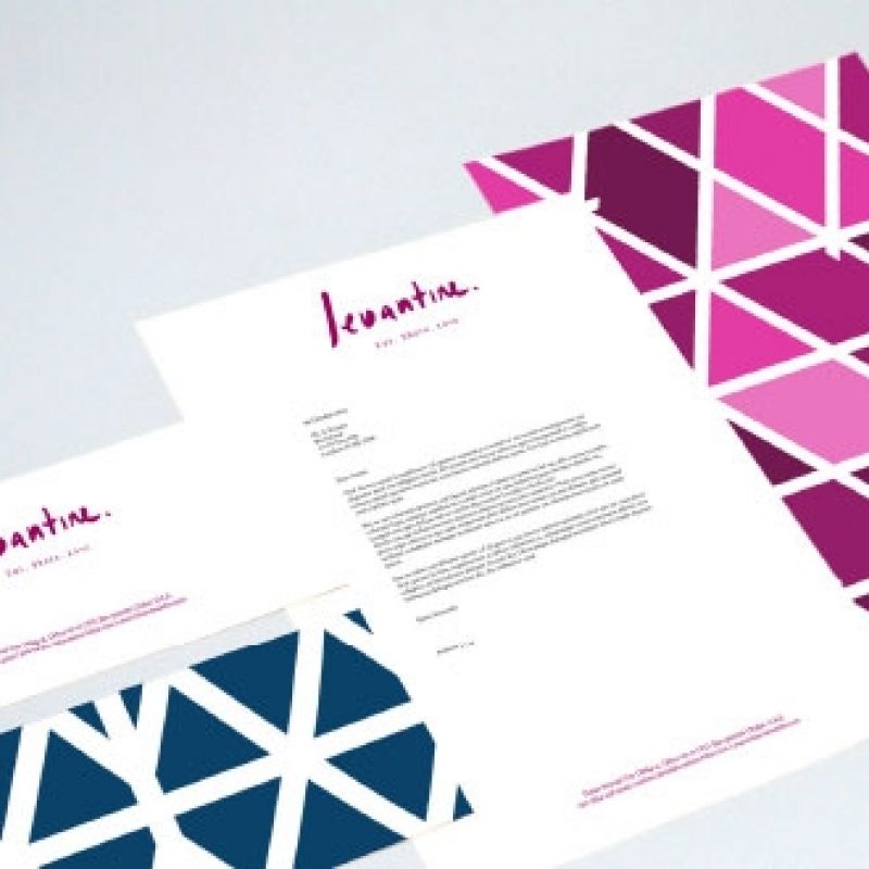

Letterhead
Letterhead
The artwork files for the corporate stationery are supplied. The original files must be used and they should never be modified or recreated.
The stationery fronts are minimal and honest, on bright white stock, which allows the berry logo to stand out. The reverse of the letterhead and compliment slip feature the two graphic versions of the bespoke pattern.
When these files are to be printed the following print specification must be sent to the printer along with the supplied artwork. Neither the artwork nor the print specifications may be modified. When typing up letters on the brand letterheads, the margins must be adhered to.
Download PDF
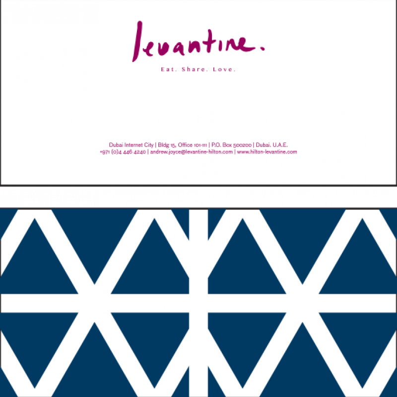

Compliment Slip
Compliment Slip
The artwork files for the corporate stationery are supplied. The original files must be used and they should never be modified or recreated.
The stationery fronts are minimal and honest, on bright white stock, which allows the berry logo to stand out. The reverse of the letterhead and compliment slip feature the two graphic versions of the bespoke pattern.
When these files are to be printed the following print specification must be sent to the printer along with the supplied artwork. Neither the artwork nor the print specifications may be modified. When typing up letters on the brand letterheads, the margins must be adhered to.
Download PDF
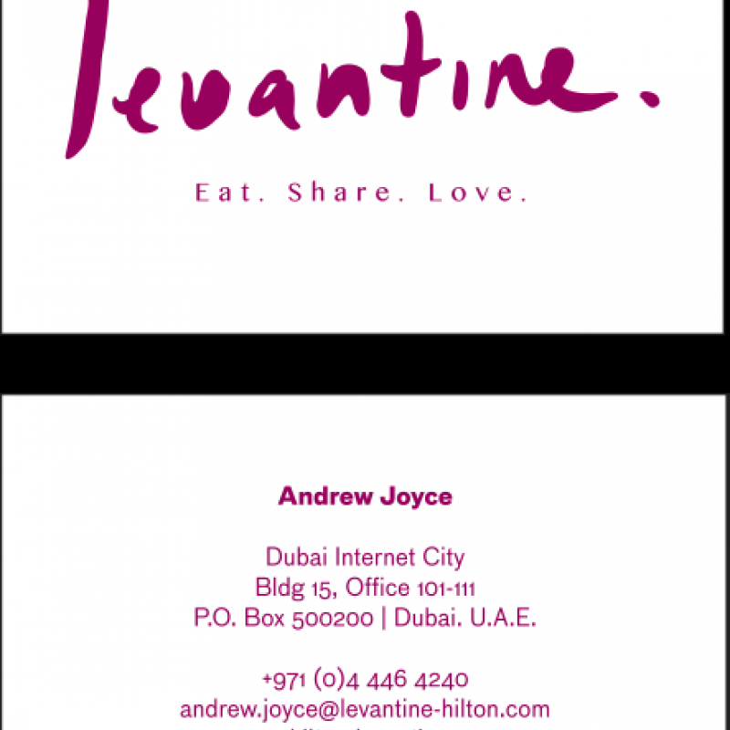

Business Card
Business Card
The artwork files for the corporate stationery are supplied. The original files must be used and they should never be modified or recreated.
The stationery fronts are minimal and honest, on bright white stock, which allows the berry logo to stand out. The reverse of the letterhead and compliment slip feature the two graphic versions of the bespoke pattern.
When these files are to be printed the following print specification must be sent to the printer along with the supplied artwork. Neither the artwork nor the print specifications may be modified. When typing up letters on the brand letterheads, the margins must be adhered to.
Download PDF
Signage
Signage
Signage
-
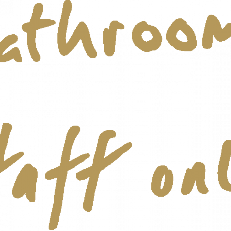

Internal Signage
Internal Signage
The internal signage for the scheme is bespoke hand rendered letterforms, which parallel to the brand logo.
Bathrooms and Staff Only are to be applied to doors only. Directional signage will appear within the restaurant where applicable. Artwork is supplied to scale.
As with the external signage, all written words will be cut from polished brass.
Download PDF
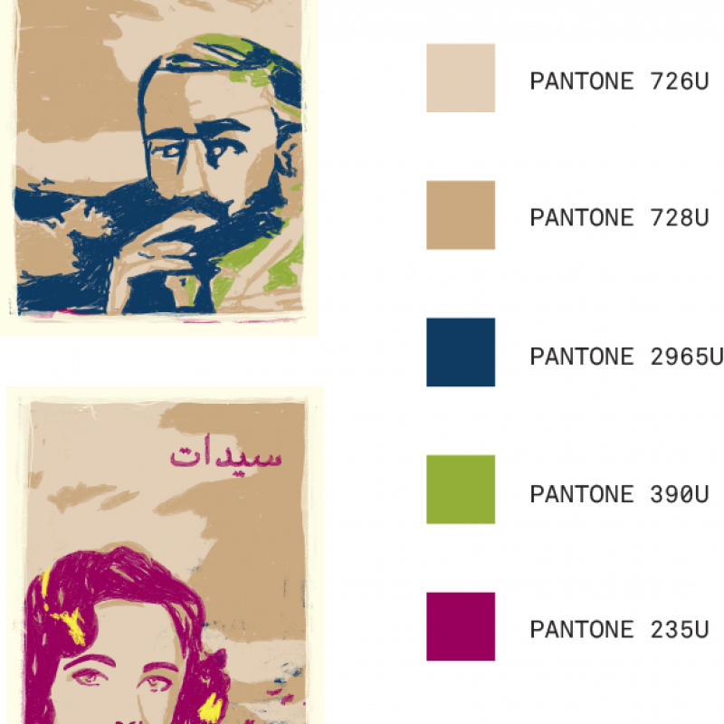

Bathroom Signage
Bathroom Signage
The bathroom signage bespoke illustrations havean aged aesthetic, indicative of 1970s Beirut signage.
These will screen be printed onto enamel signs, using the brand Pantone colours.
Download PDF
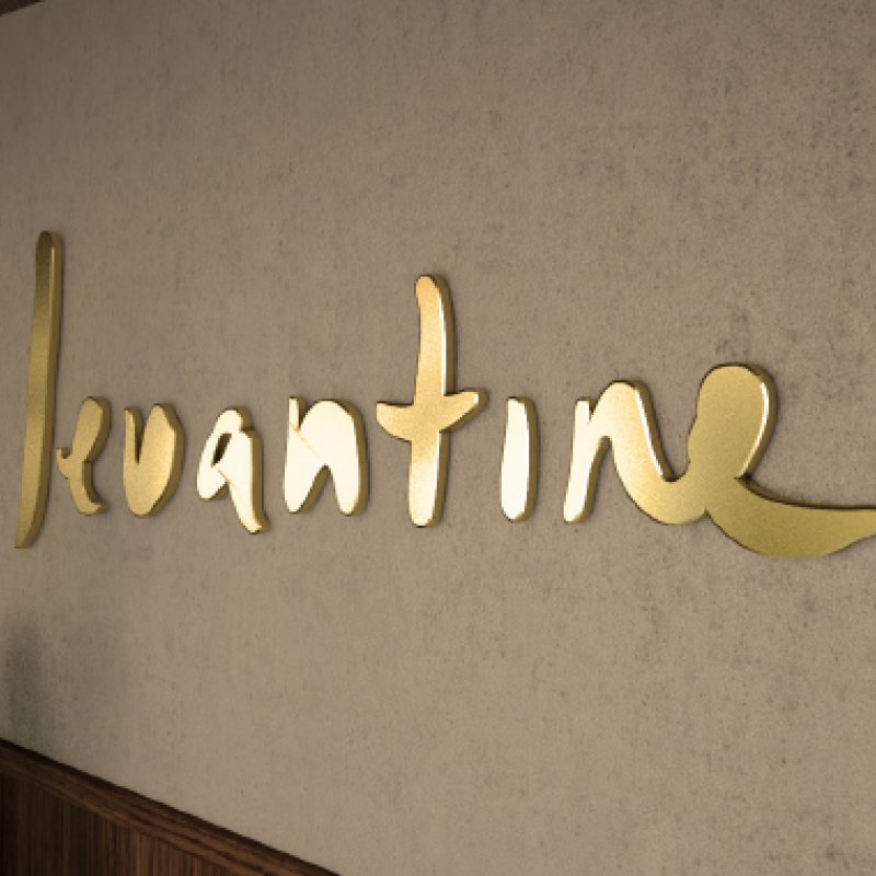

External Signage
External Signage
The external signage for the restaurant must use the brand logo, and must not include the strapline.
The sign will be halo-illuminated and finished in polished brass metal, treated for external use.
For occasions when Levantine cannot be used as the name, use the previous mentioned alternatives.
All signage must be at the given sizes.
Download PDF
� Loading
